Responsive eLearning
For several years eLearning had been restricted to rigidly fixed dimensions. In the past this hasn’t really been an issue as modules were typically delivered via a customers desktop computer.
Now the whole paradigm of eLearning delivery is being changed thanks to the explosive uptake in mobile devices and the way typical technology users interact with their devices. Fixed width solutions are now too restrictive because they exclude a myriad of delivery types, this can limit the shelf life as well as alienating a large proportion of a potential audience.
Adaptive web design techniques can address some of the issues when delivering to multiple devices, but complexity and budgets can soon spiral when still only targeting certain devices. However, responsive design techniques are now beginning to be adopted as a way to reach the widest possible audience without creating multiple versions of the same product.
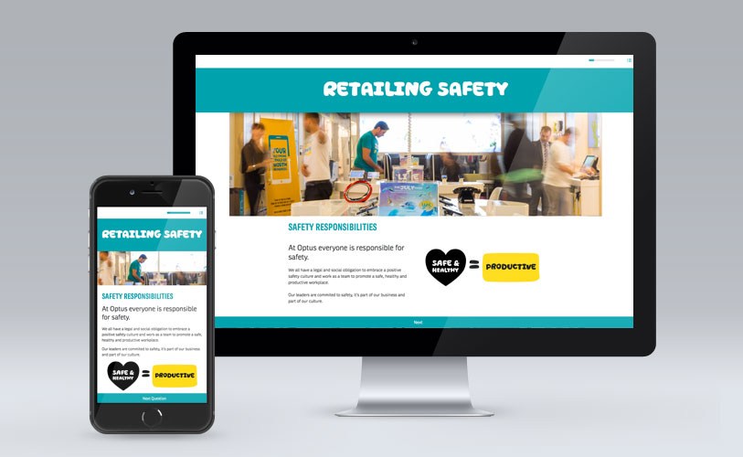
Utilising the open source Adapt Framework, the Retail Safety prototype was put together to illustrate that it is now possible to throw out the fixed width solution and still create a highly responsive, interactive learning module within a short timeframe.
In fact the prototype was so successful that the client has now gone into full scale production of their eLearning library using this methodology.